

The Way of the Walnut. My charts explained.
Recently, I have had more and more people ask me to explain my charts and what all the lines mean! I guess if you have not been following me since January 2023 then it may well be hard to understand the evolution of my charting. So, let’s get stuck into what it all means!
It is important for readers to know that in this blog I am only sharing my TradingView chart setup with you and I have already discussed my Sierra layout in other episodes which you can find here. To try and keep this as simple as possible, I will breakdown my TV chart section by section.
Walnut Levels
These should need should need no introduction, I have three types of Walnut Levels. These are:
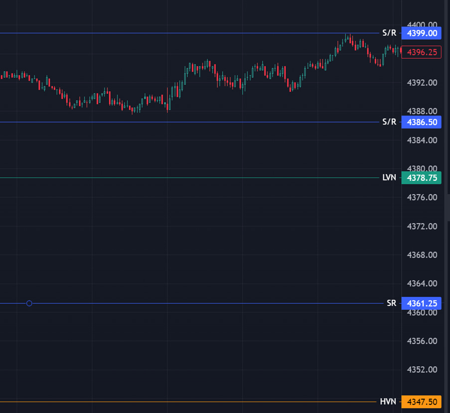
Support & Resistance (SR) – These are blue lines on the chart where order flow and price action confirms that price respects these areas over time
High Volume Nodes (HVN) – These orange lines are where price has often consolidated and created a high volume shelf. These areas often attract price towards them and can be used to swing trades on higher time frames.
Low Volume Nodes (LVN) – These green lines are where price cuts through quickly either consolidating above or below. Often areas like this create “singles” within its region and price revisits these areas for further consolidation before moving on.
Where do these values come from?
I am assuming readers are familiar with price action so I will not waste time explaining support & resistance, although I will say that walnut SRs also have order flow confirmation, so you will need to understand and read my chapters about order flow on Sierra Charts (the link is at the bottom of this post). With that said, I will explain the other two elements in more detail:

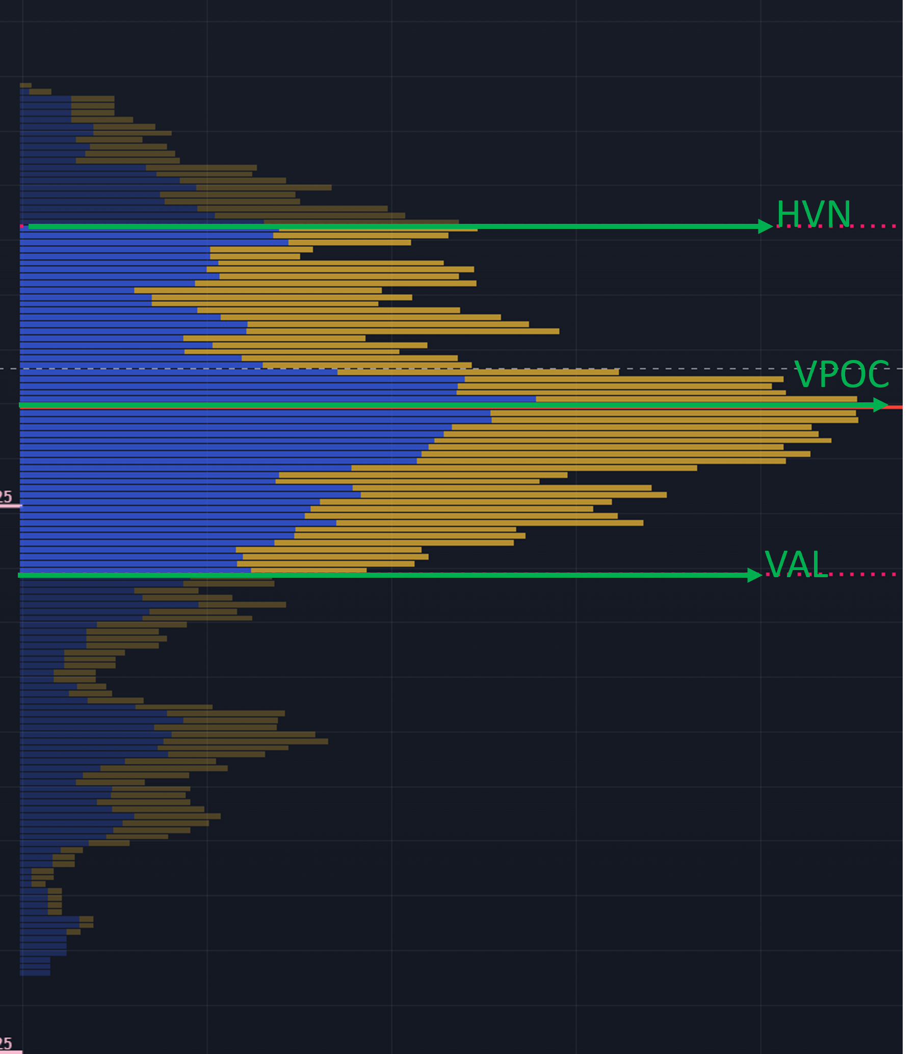
You can see from the above, the peaks and troughs which are left by price action on the volume profile of a day’s session. The troughs become our LVN areas and the peaks are our HVNs. Where there are anomalies, there is interest.
So now hopefully, when you see area like the one below on my chart, you can understand how to read it:
Value Areas
Another Walnut favourite on our charts should always be the prior day’s value areas. These are marked out on my charts in the following way:

These lines are:
Value Area High (VAH) – this is the prior day’s value high, where sellers stepped in to bring price down
Value Point of Control (VPOC) – this is where the most volume was traded, or the largest HVN in the prior day’s volume profile
Value Area Low (VAL) – this is the prior day’s value low, where buyers stepped in to take price up
These above areas are crucial in helping us form our bias around price action. If price is within yesterdays value area then we can refer to this as “rotation” that is to say that price is expected to have a minimal range. If price is above the VPOC then this is healthy for buyers, below the VPOC and this is healthy for sellers.
It is always crucial to pay attention to where price is in relation to the value areas. I personally prefer to narrow these value areas down to only that of the prior day, but some people use the last much longer time frames to refer to value – personally that gets too complicated for me.
Where do these values come from?
Once again, the importance of volume at price cannot be underestimated, the volume profile is where the above values come from. The region where price has traded 70% of the day’s volume is referred to as the value area. These are marked out by the more vibrantly coloured areas on the diagram below, whilst the vpoc (the highest peak) is exactly in the centre of this neat profile shape:
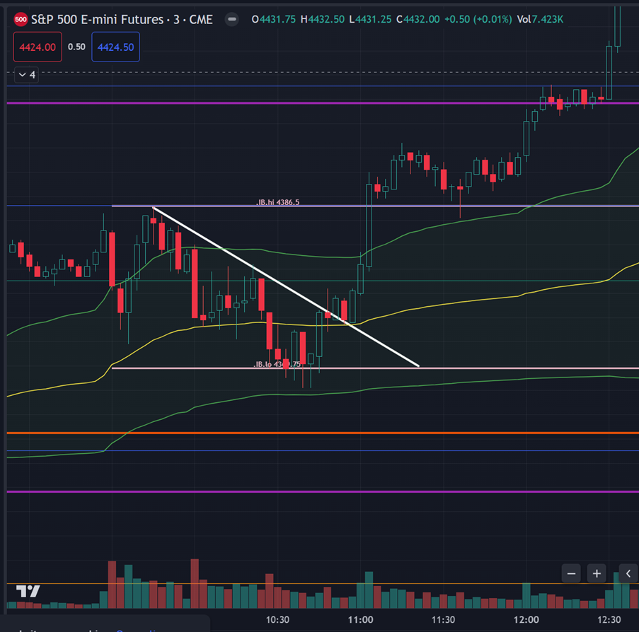
Initial Balance
The next part of doing things the walnut way is to draw the initial balance on your charts. This is a simple concept and won’t need much explaining. The IB is essentially the first hour’s range after the open of the New York Stock Exchange (Also referred to as RTH or Regular Trading Hours). This opening range must last from 9:30 to 10:30 in order for it to be drawn and looks like to solid white lines on my charts like below:

The IB is an excellent intraday tool for measuring not just directional bias but also as support & resistance, more often than not, you will see price respecting IB once it has been drawn out.
Volume Weighted Average Price Bands
Okay, I have saved my favourite indicator until last.
The best way to describe every indicator anyone has every invented is using this one word: useless.
None of these lines we have on our charts mean a thing unless the big boys with the seven figure trades are for some reason using the same lines as us to define value. That is where vwap comes in. If you were to call an ETF tomorrow and ask for an immediate purchase of equity, they are legally obliged to offer you fair value at market price, how do they define this “fair value”? The answer is vwap, an age old definition for value in the market intraday.
It is for this reason that the vwap bands are so powerful, they are on every trading desk screen, every large algo has vwap as part of its make up, put simply they are not to be ignored.

So in my charts, you will see a yellow line, which is vwap from the true session open at 18:00 EST. The green bands above and below at the standard deviation of price are the 1st std dev bands, there are several others readers can toggle on and off but I prefer just to use the 1st.
Where price is using the upper band as support, we will get a trend day to the upside, where price is using the lower band as resistance we will get a bearish trend day. One must always expect order flow to react to price touching these lines as more often than not, it will.
So, there you have it, all of these elements, that have taken me years to refine and adapt into a strategy is what makes up the way of the walnut. I hope that it brings you the clarity it has brought to me over the years.
As with all things trading, you can have as many lines on your charts as you like, but if you can’t be disciplined and execute in a way that manages risk, you won’t find any change in how you trade.
In the next episode, we will go back to focussing on our execution in these volatile times.
Until then, lets keep grinding.
Much love,
PW
____________________________________________
What Is Apex Prop Trading?
Don’t risk your own money until you are a consistent trader. Use Apex instead. I found my consistency using them. I wrote about it in detail here.
Click here to find out more and get a 71% lifetime discount with code SAVE71
What are Walnut Footprints & Sierra Chart?
I explain how to read my footprint chart here. You can download and use it for free!
I wrote a detailed breakdown of how to sign up for a 14 day free trial of Sierra here.
How Do I Get Into The Walnut Discord?
I want to grow our discord communities (clubs) so that they are self sufficient and a place of safety for newcomers. To do this we operate under a slow-growth policy, but to be added to the waiting list click here.
VPOC are good to watch on the daily profiles. Act like magnets for price.
Hey man, is "Value Point of Control" the same as "Virgin Point of Control"?
Thanks!