


Market Profile Charts Explained!
Special Episode: Walnut Chartbook Explained

A tool that I often refer to intraday but have not written much about is going to be our topic of discussion. While traditional candlesticks offer a glimpse of price action, Time Price Oppurtunity aka TPO charts (also known as Market Profile charts!) unveil the intricate dance between buyers and sellers. For beginners, however, these charts can appear tricky to get your head round. Hopefully, this episode will equip you to leverage their power in your day trading strategy.
What are TPO Charts?
Imagine a bustling auction where buyers bid and sellers offer. As the auctioneer shouts out the prices, where price was too cheap or too expensive you would bidders rip through that price range quickly, and where there is more interest in a price you would see many bidders pop up offering a price, there by slowing down the auction in that price range.
TPO charts capture this dynamic on a visual canvas. Instead of focusing on price changes, they highlight the time spent at each price level during a trading session. Clever!
Here is an example of an RTH session on a market profile chart:
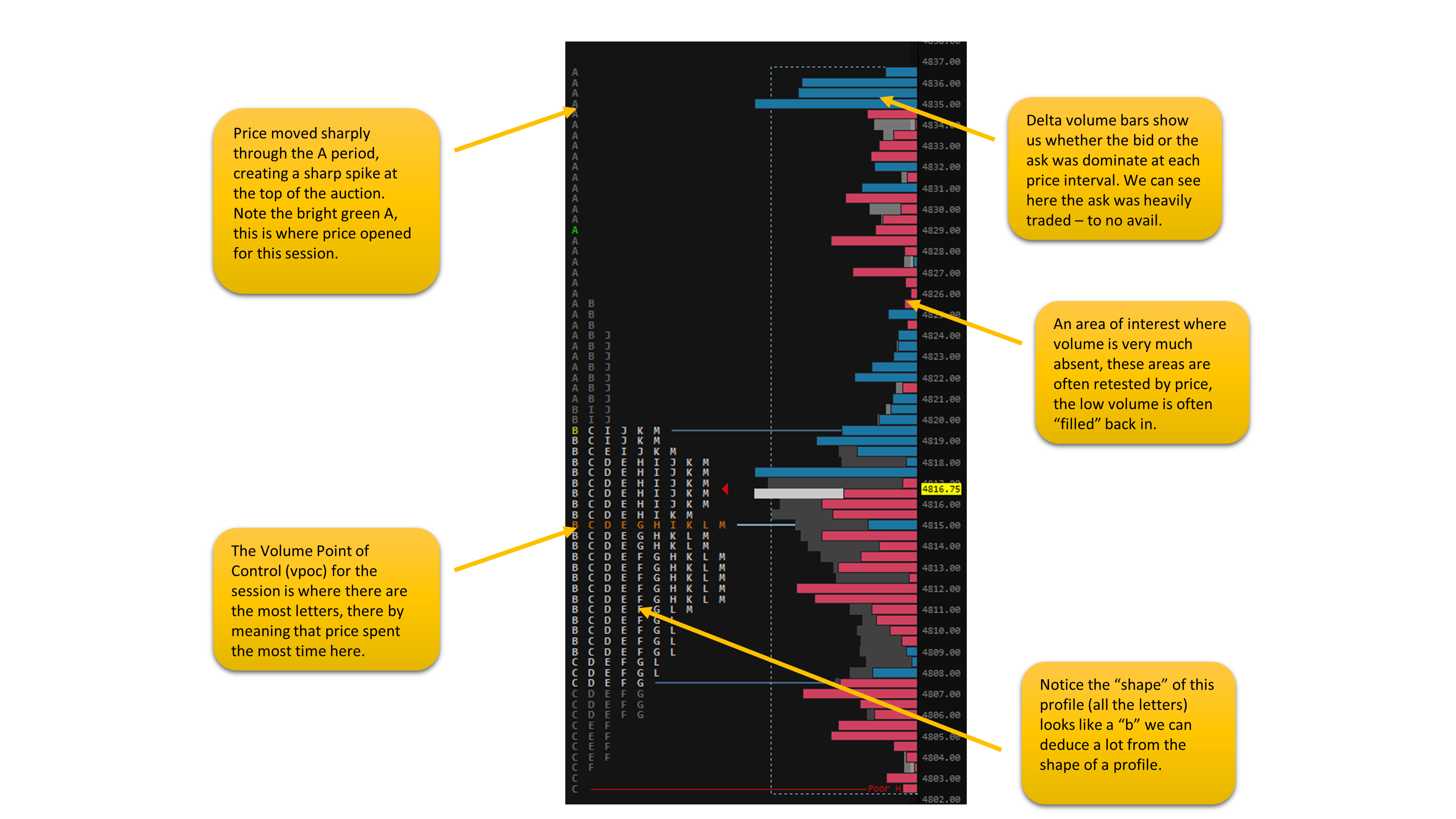
Each horizontal line on the chart represents a price level. The alphabet TPO letters or blocks, show the length of time the market traded at that specific price. The more letters in a row, the more time price spent there. Each letter on my chart represents 30 minutes so where you see the letters ABCDEFGHIJKLM you know that all the A blocks represent what happened in the first half hour and so on.
Okay, so now you know what the market profile is, how do you use it to exploit nuances in how it interprets the auction? Here are some key things to look out for both in your end of day analysis of the action as well as your intraday analysis.
Value Areas (VAL & VAH) and the Point of Control (VPOC):
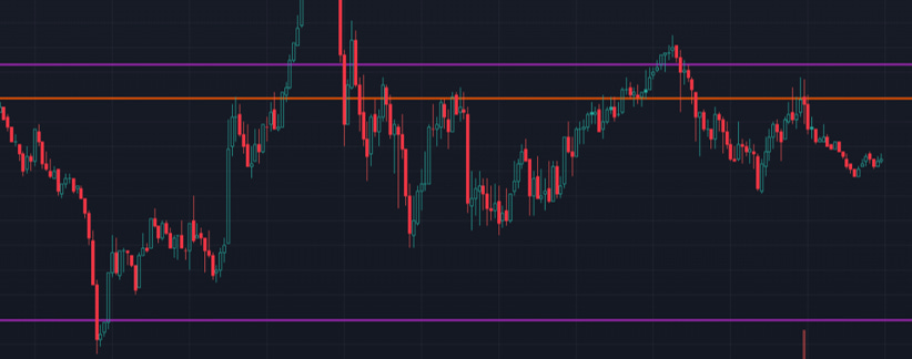
The VA isn't just a fuzzy zone; it has a king – the Point of Control (POC). This is the specific price level within the VA where the most time was spent. The POC identifies a pivotal point of balance, a price level where neither buyers nor sellers dominated. Think of it as a tug-of-war rope hanging limp; neither side has gained ground. Time and time again, we see price respect prior day value areas as well as respecting the vpoc. They are a must-have on my chart, take a look below, the purple lines are a prior day’s value area high & low and the orange line is it's vpoc. You see how this works?
Unfinished Auctions: Price Extremes Hold Clues
Another important question to ask when looking at the market profile is - Were there significant periods spent at the daily high or low?
These unfinished auctions indicate buyer/seller aggression but without sufficient follow-through. A high with substantial time but weak closing price suggests potential selling pressure to come. Conversely, a low with extended time followed by a higher close hints at potential buying power building up.

Single Prints: Phantoms in the Trading Landscape
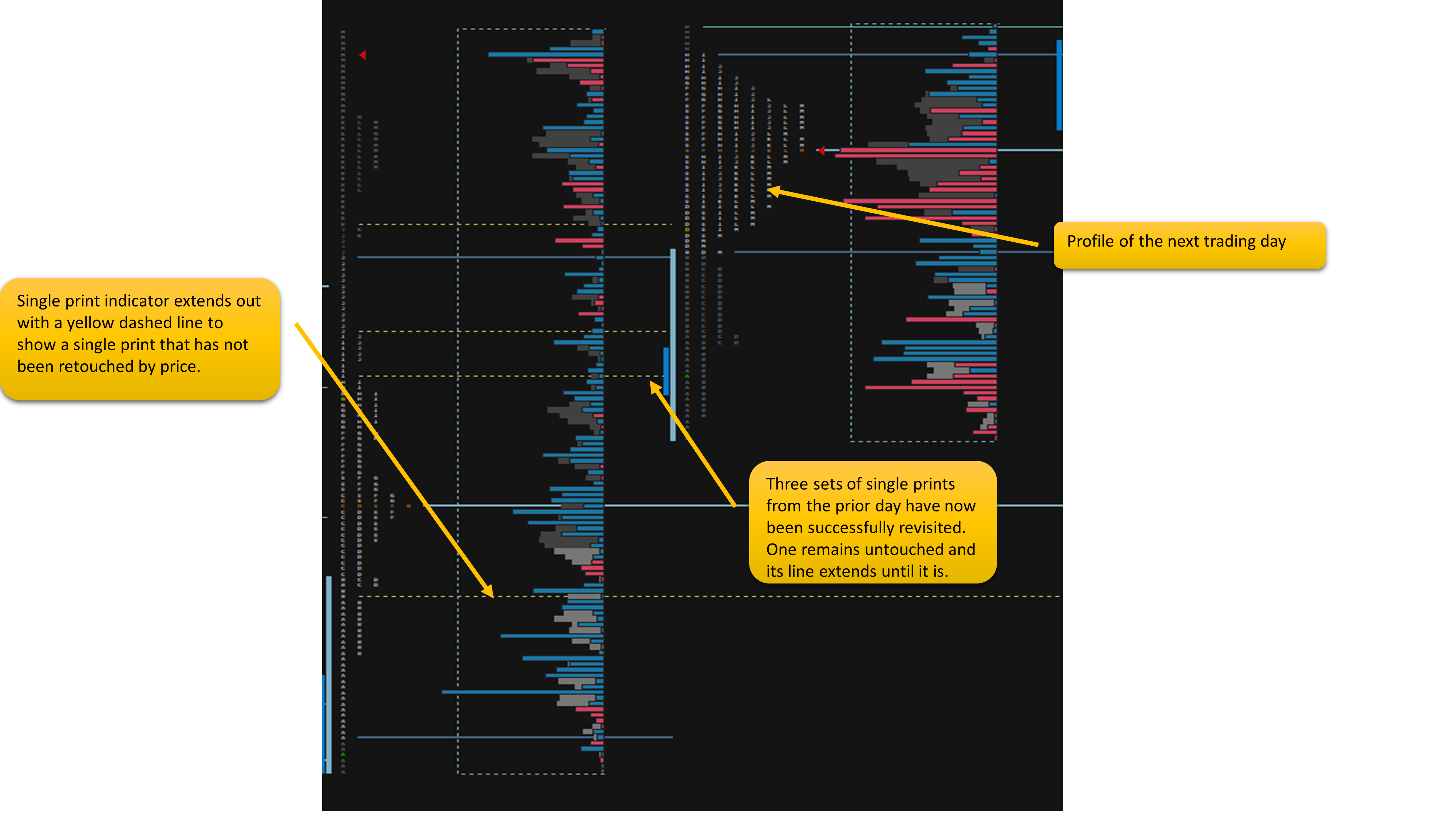
Occasionally, you'll see isolated blocks in the middle of the profile with no other letter on that row, these are called single prints. These represent rapid movement through a price level with minimal sustained activity at that price. The auction will want to revisit these areas as it is seen as an incomplete auction at that price, buyers and sellers didn’t have a chance to decide value here. Let’s take a look at an example:
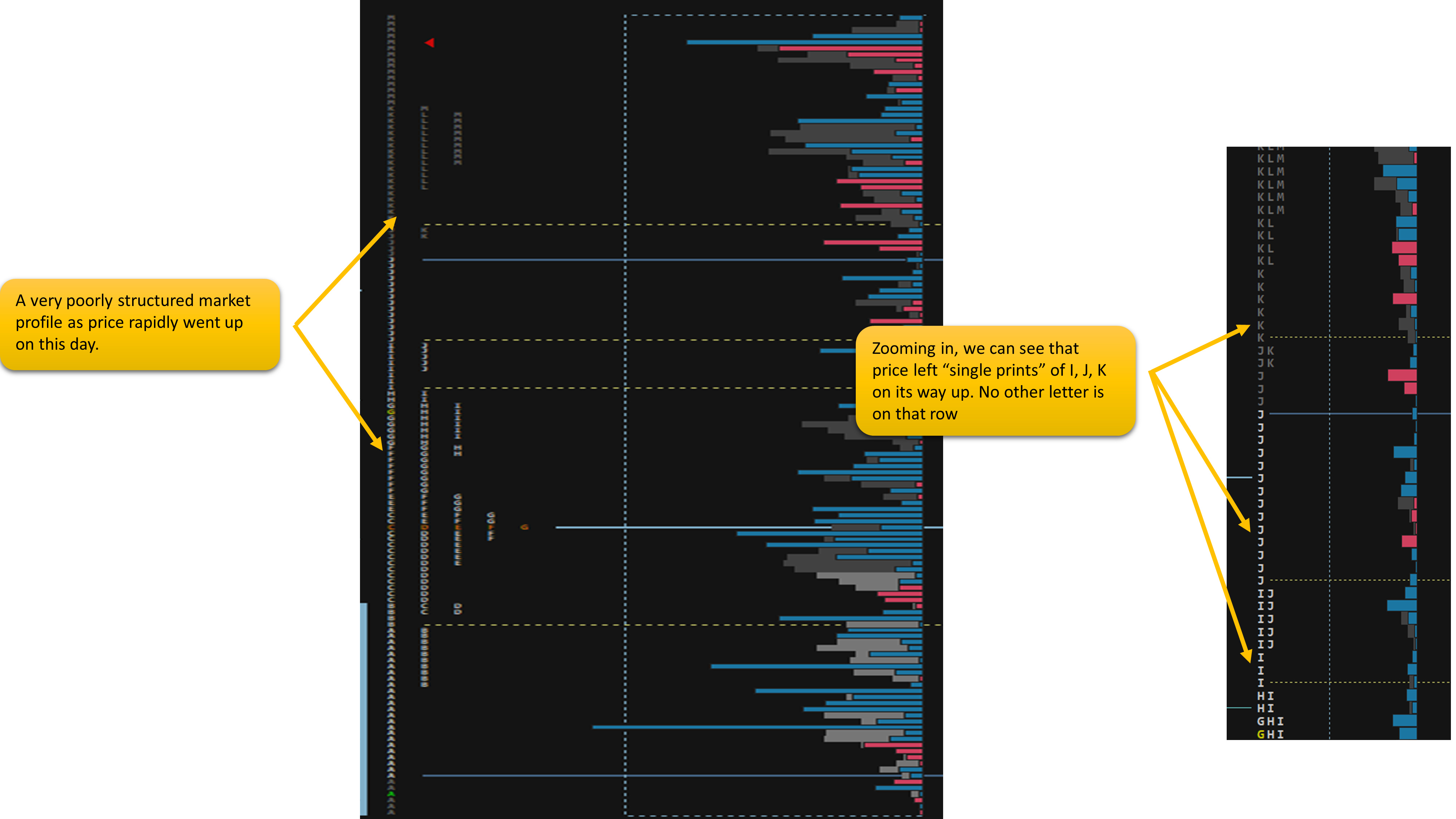
The interesting this to note about single prints is that the market will try and revisit them, sometimes during the day itself – leading to a nice target for buys/sellers who read the action well enough but at other times these single prints are filled in the coming days/weeks. Noting poor structure on the market profile and the singles associated with it is an important part of TPO charts. Have a look how the poor structure in the example above was revisited by price:
High Volume Nodes: Beacons of Opportunity
Within the VA, some price levels boast taller volume delta bars than others. These high volume nodes showcase concentrated trading activity. They can act as support or resistance depending on the context. If price approaches a high volume node from below, it might encounter buying pressure, potentially reversing the downtrend. Conversely, approaching from above might trigger selling, pushing the price lower.
Low Volume Nodes: Areas of Indecision
Conversely, low volume nodes within the VA indicate minimal time spent at those prices. Think of them as empty seats in the trading theatre. They suggest indecision or apathy at those levels and may not offer strong support or resistance. Price hovering around a low volume node could break through easily, lacking significant buying or selling pressure to hold it in place.
Both high volume nodes and low volume nodes act as magnets pulling price in its diection.
Practice Makes Perfect
Remember: TPO charts are not crystal balls. They offer valuable insights, but interpretation requires experience and context. Combine TPO analysis with other technical indicators, fundamental analysis, and sound risk management practices for a well-rounded day trading approach.
Don't just read, explore! Download my Sierra Chart TPO chart used in this episode for free from here!
Also remember folks, day trading is a marathon, not a sprint. Dedicate time to learning, refine your strategies, and manage your risk wisely. With TPO charts as your guide and consistent effort, you'll chart your own path to trading success.
Much love,
PW
Supporting My Work
All my work is free and will always be! No Subs, No Bullshit. I am not a furu and I do what I do because I love it. If you want to support me in keeping this free you can do so here.
What are Walnut Footprints & Sierra Chart?
I explain how to read my footprint chart here. You can download and use it for free!
I wrote a detailed breakdown of how to sign up for a 14 day free trial of Sierra here.
How Do I Get Into The Walnut Discord?
Our discord is free to join and all I ask is that you are active in there from time to time, asking questions and sharing what worked and didn’t work for you, there’s instructions once you join, all you got to do is click here.